DSNY Refuse Collection ›
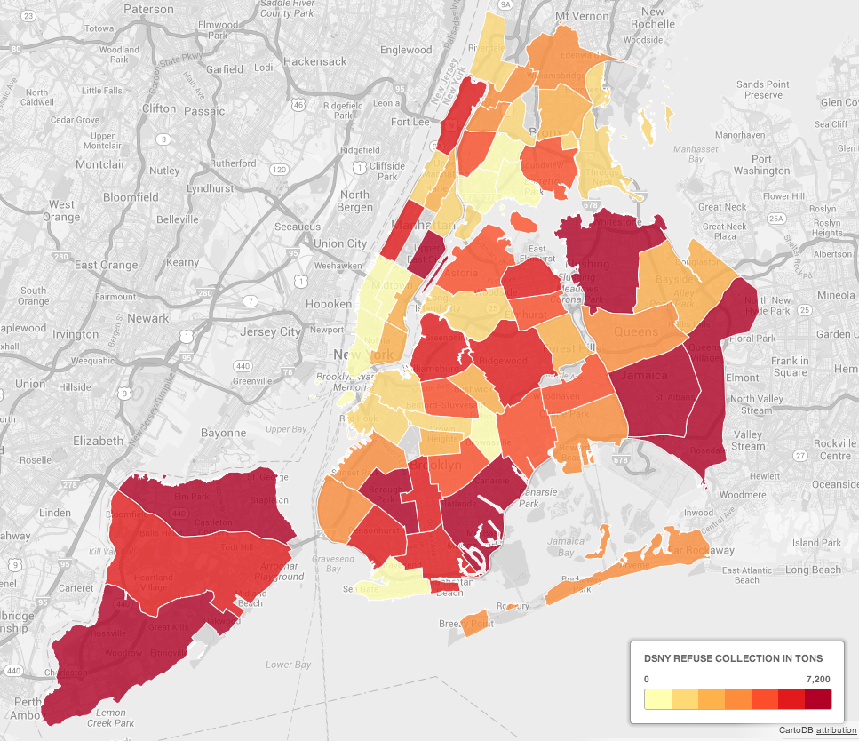
The above map was created from NYC Open data regarding collection tonnages by the New York City Department of Sanitation. The map is divided by collection districts and colored by the total refuse collected in tons. The greater to tonnage collected, the darker red the district becomes. Unfortunately, the data that created this map was only one months worth of data from November 2011. This represents only a small fraction of total collection.
This map does however, point to some interesting anomalies. My immediate reaction was the lower collection tonnages in Manhattan (excluding the upper east side which I did expect to see high collection rates. A study to show the correlation between waste and income pending) compared to Staten Island. Mainly, I would have guessed that the high population (and population density) in Manhattan would show higher tonnages than areas in Staten Island where population is much less. The counter argument is that the Staten Island districts are much larger and therefor may incorporate more people and greater waste tonnages, though I find that hard to believe compared to the extremely high population of Manhattan.
View the data